Hello Guys, Now I have my own Blog Site. please visit Link for more Android and Kotlin Tutorials.

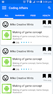
In this example I will teach you how to add Material Design and smaller Rating Bar in your Android Application.
Resulting smaller and material design rating bar can be seen in attached image.

Add this in your layout XML file.


                    <RatingBar
                    style="@style/RatingBar"
                    android:layout_width="wrap_content"
                    android:layout_height="wrap_content"
                    android:numStars="5"
                    android:rating="3.5"
                    android:stepSize="0.5" />
Basic idea is to set parent to material rating bar to smaller.
<style name="RatingBar" parent="android:style/Widget.Material.RatingBar.Small"> <item name="colorControlNormal">@color/primary_light</item> <item name="colorControlActivated">@color/primary_dark</item> </style>This style can only be used as indicator. it do not support user interaction. If you need to support user interaction use Default Rating Bar. i.e "Base.Widget.AppCompat.RatingBar" as parent. Also num of stars property only works with width wrap content when working with default Rating Bar. You can customise rating bar to make it look like standard yellow rating bar using below properties in xml.android:progressBackgroundTint="@color/primary_light" android:progressTint="@color/rating_star" android:secondaryProgressTint="@color/primary_light" "progressTint" is rating color (yellow)"progressBackgroundTint" is default color (when no rating) "secondaryProgressTint" is remaining color of partially filled rating star. Note: Application theme is AppCompat and donot forget to add appcompat support dependency in build.gradle file.
Author:Hammad TariqAndroid Developer

